Get your FREE website review 👀 and see exactly what needs to change (and what doesn't)
Web | Branding
Web | Branding | Social Media
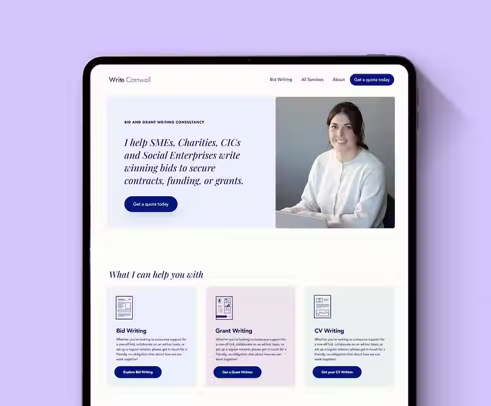
Website
Every project starts with a chat. Not a pitch, not a sales call, just a conversation about where you're at and what would actually help
Home
20% off for Female Founders
Get in touch
Newquay, Cornwall UK
hello@eloisecorke.com