How do you redesign a website that made you cringe?

A one-week website redesign for a copywriter whose website was making her question her entire business

Sarah is a website copywriter and messaging strategist selling premium services. She regularly talks to clients about why their website matters. But sending people to her own website made her so uncomfortable that she’d stopped promoting herself altogether.
She knew what was wrong, but not how to fix it
Returning to work after 18 months of maternity leave, Sarah’s website didn’t match the standard she knew would be expected of the business she was relaunching.
That uncomfortable mismatch was impossible for her to ignore, especially because she understands better than most how quickly people judge a business's credibility from its website.
The issue wasn’t just how the site looked. Sarah had ongoing concerns about accessibility, how easily users could navigate the site, and whether the website's structure properly supported enquiries.
With so much generic advice available online, she pieced together what she felt able to, but it was disjointed and showed.
“Like quicksand, it felt as though the more I struggled to fix my website, the deeper I was sinking!”

The spiral
Promoting her services and networking in person and online started to feel awkward. Talking about her work meant sending people to a place that didn’t reflect her values, personality, expertise, or point of view.
Over time, that hesitation turned into complete avoidance. Sarah stopped marketing, stopped talking about her services, and stopped attending networking events.
Her return-to-work relaunch stalled.
She could see the finished version of her website in her head, but couldn’t translate it into a working design.
Every time she tinkered with it, she ran into the same problems: colours that didn’t complement each other, cramped text that hid her messaging, and a systemless approach to building her pages that meant even small updates took days.
At the same time, pulling inspiration from other websites and social feeds left her with a mix of other people’s styles that she didn’t feel comfortable owning.
In her words, the site
“looked like a primary-school project, not that of a professional, experienced and creative premium service provider.”
Countless days were lost to constant tweaking and undoing. Her spiralling lack of confidence led her to question whether there was even a business worth building.
Enter Eloïse: The Wix witch of Cornwall

When I met Sarah, she was clear that she didn’t want a drawn-out, costly project or an open-ended process. She didn’t want to spend months going back and forth while her business stayed stuck. She needed it dealt with properly, without dragging it out.
She said:
“I choose to work with Eloïse because of her obvious and complete understanding of my problem. She was upfront about the fact that although my stuck website had turned into something huge for me, it was something that she could fix quickly. She explained, with bang-on visuals, what my site could be, talked me through her reasoning, and instantly removed a lot of the pressure I felt about trying to get it right on my own.”
She wasn’t looking to learn design or weigh up endless options. She wanted someone to take responsibility for the decisions she was struggling to make, explain those decisions, and handle the work she knew she wasn’t equipped to do, so she could get back to running her business.
Becoming unstuck
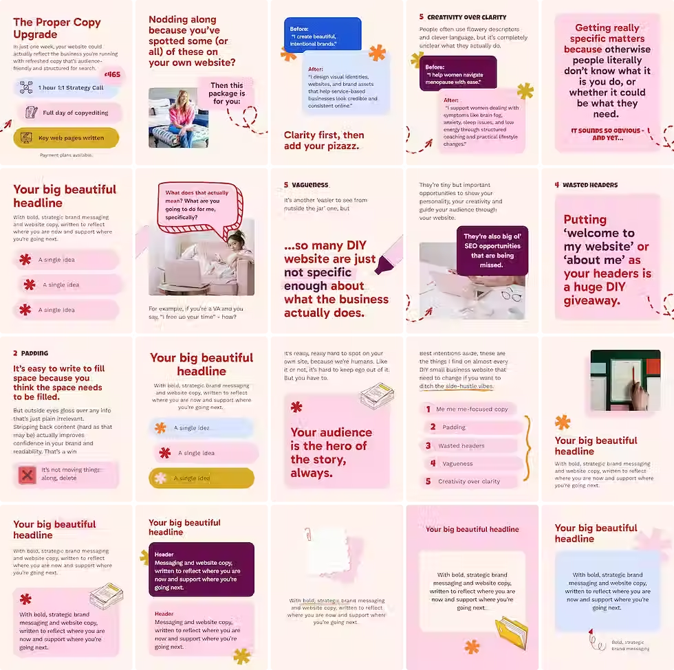
The aim was never to follow trends or mirror competitors, but to create something that Sarah and her brand, The Proper Copy Studio, could confidently stand behind.
“I want my brand to feel comfortable; instead of like wearing a bra that doesn’t fit properly.”
Using the Waiting Room exercise, Sarah described the kind of space she wanted her business to feel like: expert, welcoming, collaborative, cosy co-working vibes, and very human. That became the anchor for my design decisions.

I used moodboards so that Sarah could straight away see her own vision laid out in a way that worked. It helped her recognise that her site wasn’t just fixable; it had potential. What she already had didn’t need to be thrown away, just pulled together.
The new website was built with accessibility in mind, a typography system that gave her copy space to breathe, and reusable sections she could easily update herself as her business grew.
Everything was designed to work across Wix and Canva, so the website and her social content could live in the same system - a time saver and a more cohesive brand.
The Proper Copy Studio: Life after launch
Since launching her new website, Sarah has been successfully been managing it herself.
She’s added new pages, updated copy, and adjusted services without rebuilding everything from scratch each time.
She still has my support when she wants a second opinion, but the site no longer makes her feel like an imposter in her own niche.
It’s changed how she feels about her business.
Not only has she been happily promoting her work and regularly networking again, but she’s already had aligned enquiries since the redesign.
She said:
“This is so much more than just a new website and a pretty colour palette. I’ve got confidence back in myself, my abilities, and the future of my business. Before this, I was genuinely considering giving up. Now that idea feels laughable! Of course, my business is going to work; I just needed Eloïse Corke in my corner!”
If you're avoiding promoting yourself because your website no longer reflects what you stand for or what you do, you don't have to keep plugging away at it alone.
In one week, I can help you find your way and get it done properly.



Comments