Bored of Your Brand Identity? Here's How to Refresh It Without Starting Over

I hear you. It’s really easy to fall out of love with your brand, even if you still love the colours.
Maybe you want to feel a little more professional. Maybe your business has evolved since you quit your 9–5 and turned that side hustle into something that, omg, actually pays the bills.
So what do you do? Burn it all down and start again?
It’s an option. But before you do that, ask yourself: do you actually need a full rebrand, or just a little… ahem… facelift?
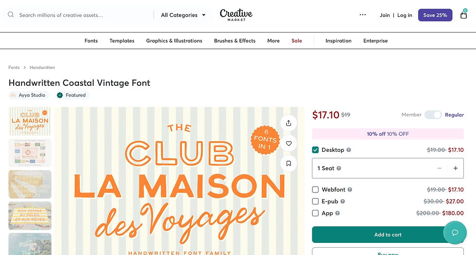
Refresh Your Brand Fonts
I use Creative Market to find something fresh. A new typeface can make your brand feel instantly more polished without changing everything else.
And if you sign up you get freebie fonts, graphics, all sorts of stuff. Very fun!
Refresh Your Brand Images
Try Pexels and find something that feels a bit fresher.
And it doesn't have to be another photo of a laptop (yawn). It could be your workspace, your favourite mug, your sketchbook, your local coffee shop, or somewhere that genuinely reflects how you work. Those little details make your brand feel much more personal.

Update Your Icons
Icons can be surprisingly tricky, but they're brilliant for directing people towards the content you want them to notice.
For example, on your services page, could you use icons that relate to each service?
I use The Noun Project because you can download matching icon sets. And don't worry about being totally literal. Your icons can be organic, playful or cute. You could even use emojis if they suit your brand.

So that's your fonts, images and icons sorted.
Check Your Brand Colours for Accessibility
Colour is often the trickiest part.
You've probably chosen colours you genuinely love. Maybe they're bright and sparky, or soft and sophisticated.
What I always recommend is checking them for accessibility. I use https://colorcontrast.app/ to make sure text has enough contrast against its background.
A few things to check:
Button text is easy to read.
Body text has strong contrast against the background.
Your primary button colour stands out from the rest of the page.
Calls to action are obvious
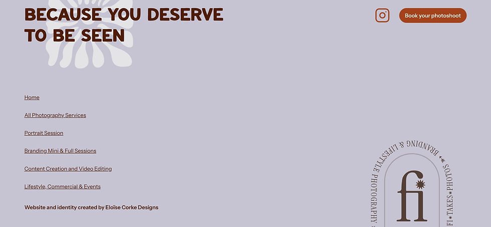
Give Your Website Footer Some Love
Is your footer boring AF?
This is where people often end up when they're looking for one last thing before they leave your website. Make it useful.
Consider adding:
Your value proposition or a bold statement.
Your primary call to action, like Book a Call or Contact Me.
Social media links (and make sure they actually work).
Links to hidden pages, freebies or lead magnets.
Your newsletter sign-up form.
It's one of the most overlooked parts of a website, but when it's designed with intention, your whole site feels more considered. It looks like you cared about the details.
And that's exactly what potential clients want to see. If you've made the effort with your own business, they'll trust you'll do the same for theirs.

Do you need a brand Identity Refresh or Rebrand?
Sometimes your business has changed so much that a refresh isn't enough.
If you're pivoting, targeting a different audience or offering completely different services, a rebrand might be the better investment.
I've written about the difference between a brand refresh vs rebrand, because you deserve to know all the facts before spending your money.


Comments