Free Brand Audit
Are you struggling to make your brand look as good as your service?
Whether you are starting from scratch or staring at a brand that feels a bit… patchy, you need clarity before you throw more money or energy at it.
This is not generic advice. It is a designer’s eye on your business, tailored to where you are right now.
You walk away with a clear review, a personalised report, and 1:1 call so you can ask all the questions you need.
✤ What should a brand audit include?
What you’ll receive from your personalised brand audit
A quick, expert check that covers the parts of your brand that matter most:

Clarity check on your message
I look at how you talk about your business across your site and socials. You will see what makes sense, what drifts, and the one line to fix first so your message lands with the right people.

Visual identity check
I review your colours, fonts, imagery and layout to show you what feels consistent and what feels mismatched. You will see quick visual improvements that make your brand feel polished and confident.

User journey review
I walk through your site like a new visitor and show you where the experience flows, where people drop off and what is quietly holding conversions back. You get one clear fix that makes the biggest difference.

Accessibility and trust scan
I check your colour contrast, text clarity, button visibility and overall readability. Small changes here create big jumps in trust, inclusivity and how professional your brand feels.

"Eloise’s audit of our site and identity hasn’t just elevated our brand, it’s had a measurable, positive impact on our revenue. Her work will be felt across the business for years to come, and we’re deeply grateful for the expertise and dedication she brought to this project.
Matt Habecker • Summit Education

Want to know what's working and what's not?
This review highlights the gaps, the strengths, and the path to a brand that truly reflects your service.
✅ Voice and messaging review
Does your message land, or has it slipped into vague “I help everyone” mode
✅ Visual identity check
Logo, colours, fonts and assets judged as a system — do they look cohesive or cobbled together
✅ User Expeirience audit
Where people get lost, drift off, or stay hooked
✅ Accessibility scan
Fonts, colours and layouts checked so your brand feels welcoming and professional
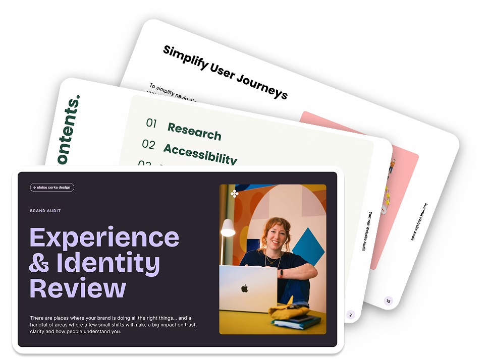
✅ Your clarity deck
A PDF report with screenshots, notes, and clear fixes for now and later
✅ A live 30 minute session
One to one, where I walk you through everything, you ask questions, and you leave with clarity and a plan
This isn’t just a list of changes, it’s a strategy for transforming your brand.
You’ll gain clarity, confidence, and a toolkit that sets you up for long-term success, all from the guidance of an experienced designer who knows the ins and outs of digital branding.
And the proof? Just look at these two brands that went through the process…
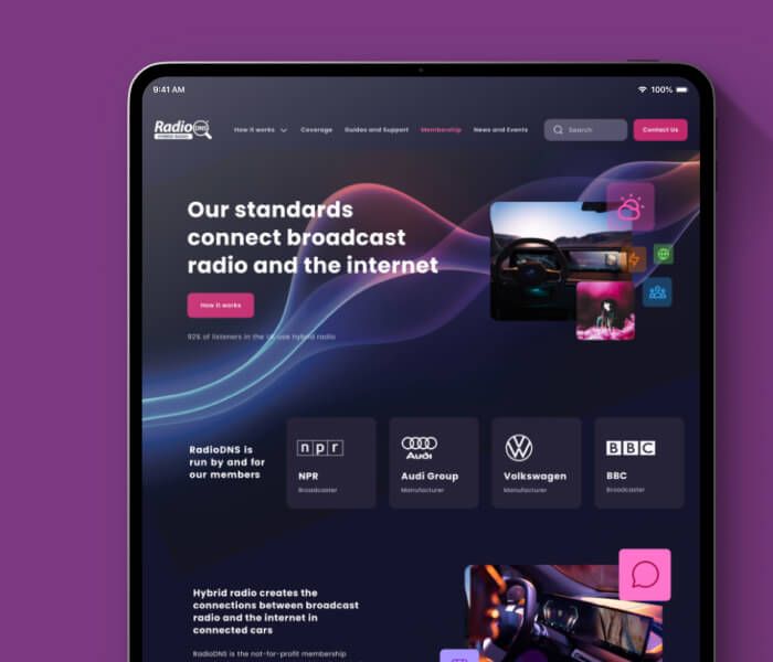
RadioDNS wanted to upgrade their visual identity and improve usability for their users. We worked together to create:
A refreshed design system that simplified their messaging.
Responsive website updates for seamless user experiences across devices.
Engaging business cards, banners, and marketing collateral to solidify their presence.
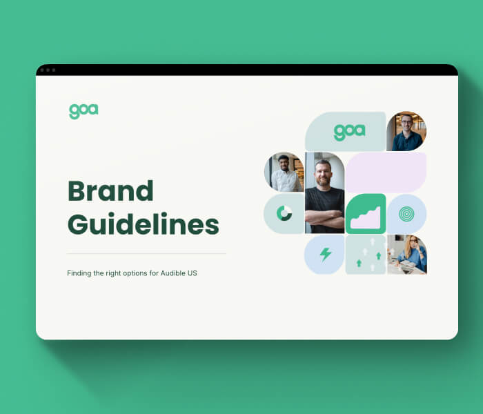
Building GOA's Brand Foundations
GOA Marketing needed a cohesive identity to unify their messaging across multiple platforms. Through a tailored brand refresh, we delivered:
A polished visual identity that reflects their professionalism and creativity.
User-friendly templates and marketing materials to support their global campaigns.
A comprehensive brand system that ensured consistency across digital and print assets.
Confusion is expensive
It costs you trust when your brand looks mismatched.
It costs you clients when users click away halfway.
It costs you confidence when you are second guessing everything you share.