BRAND REFRESH
Crafting a Scalable Brand Identity and Impactful User Experiences
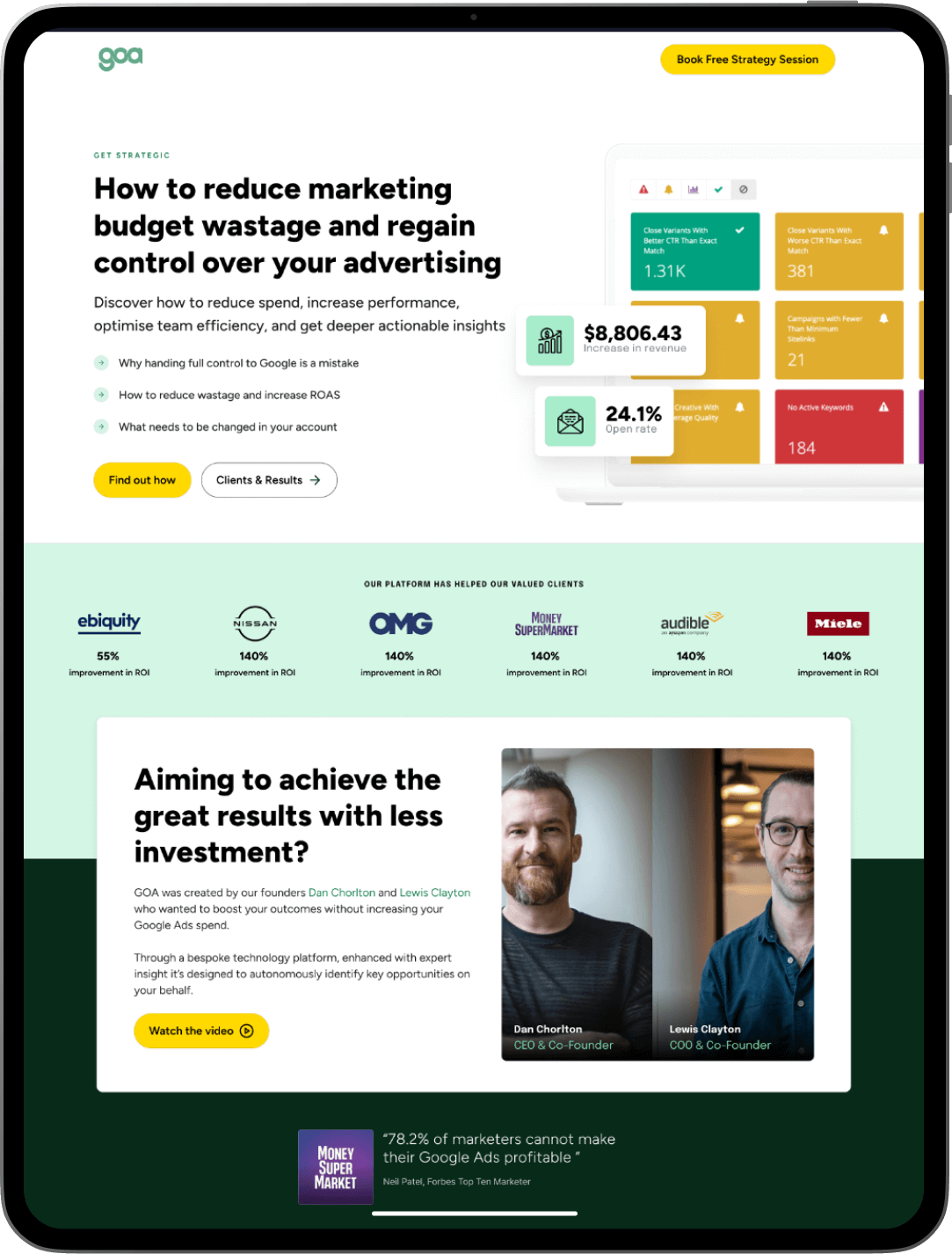
GOA Marketing approached us to help elevate their brand positioning and create a scalable system that could support their growth as leaders in the marketing field. Their goals were clear: refresh their brand identity, optimise their landing pages for A/B testing, and build awareness around their expertise in marketing for large-scale businesses. Our work didn’t involve a full redesign, but rather a thoughtful refresh to align their brand with their ambitions. The result? A stronger, more consistent brand presence that drives results.
VISUAL IDENTITY
01. A Strategic Brand Refresh for a Clearer Positioning
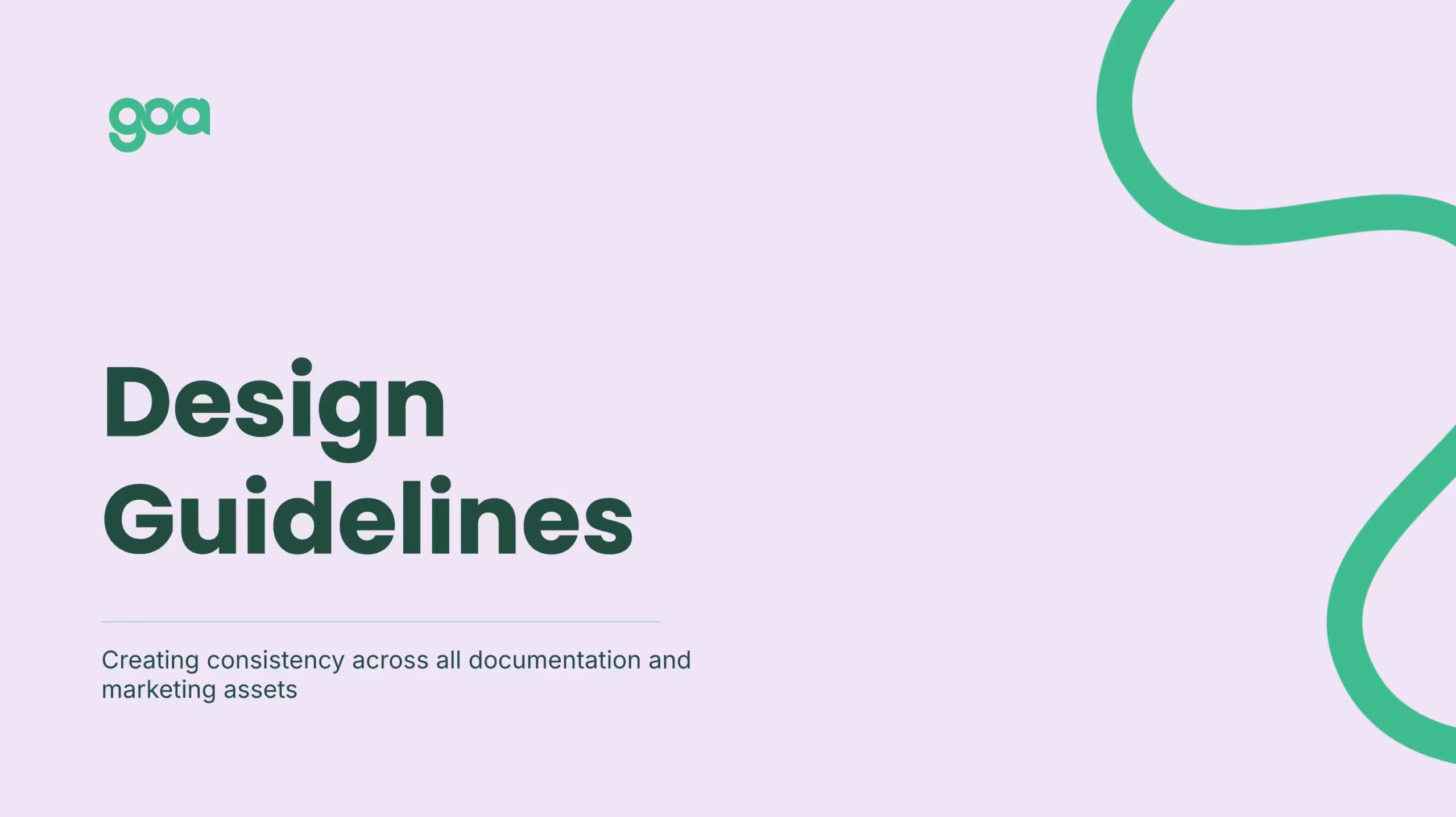
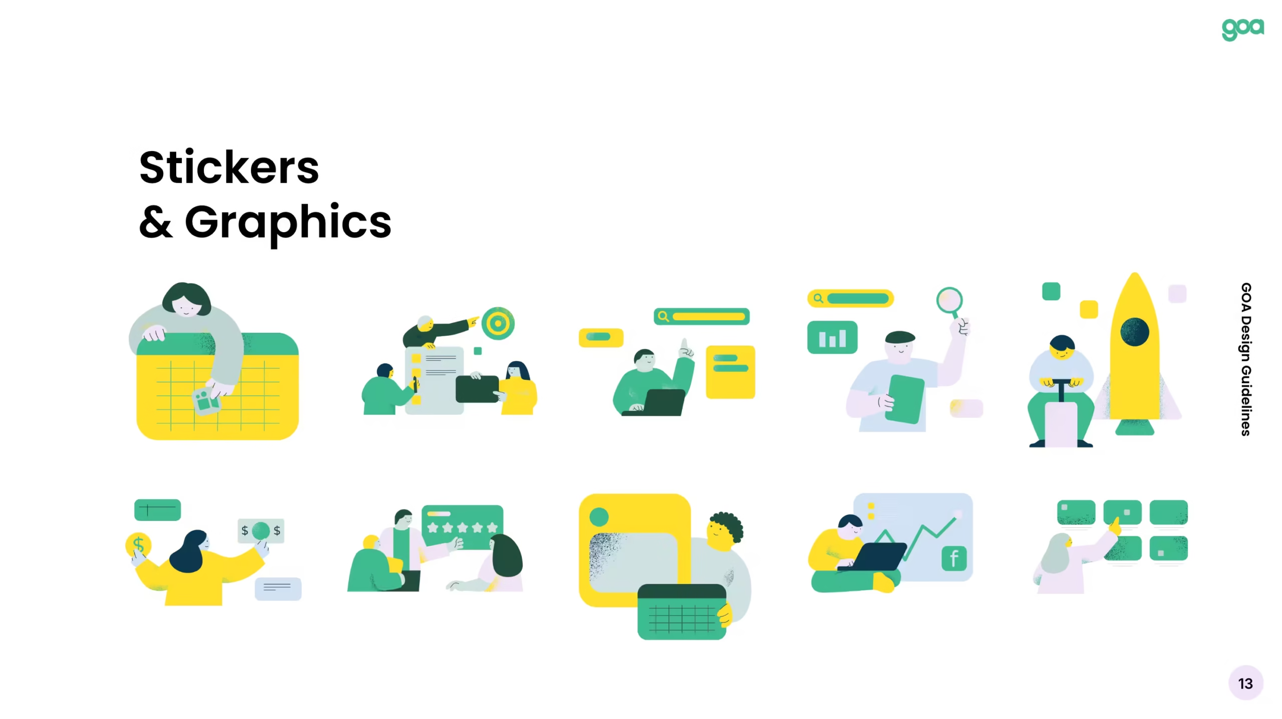
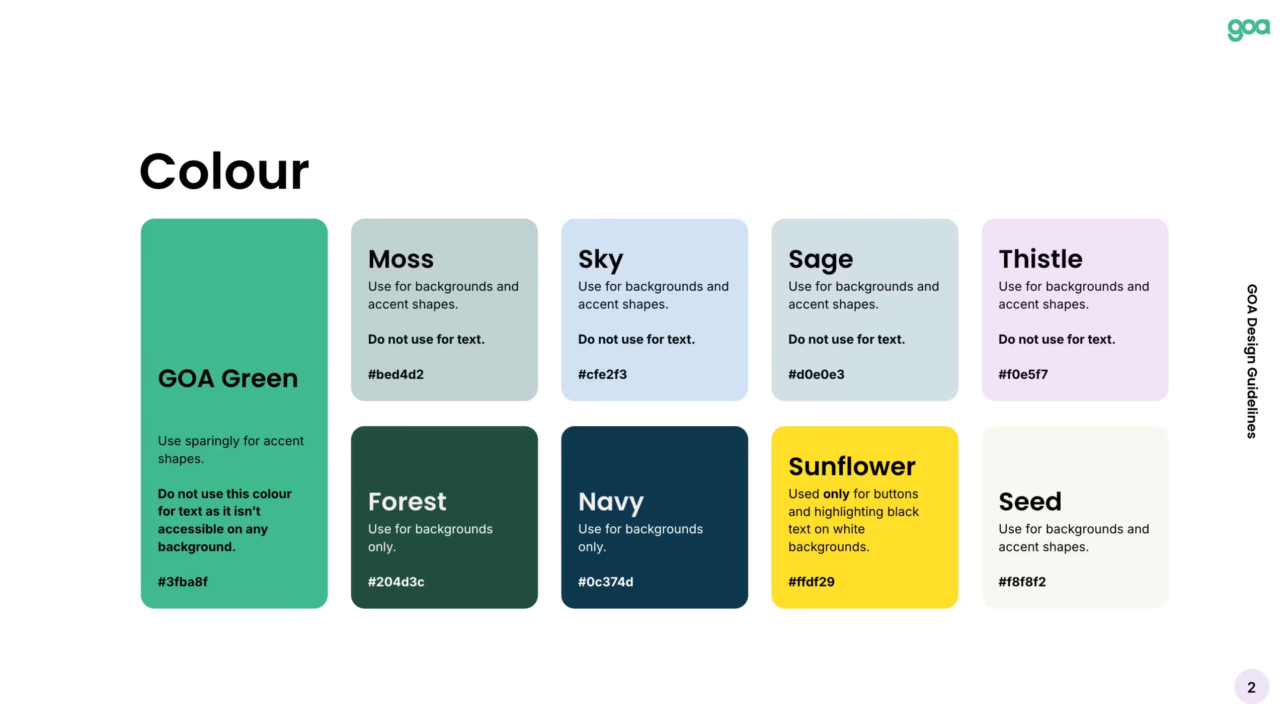
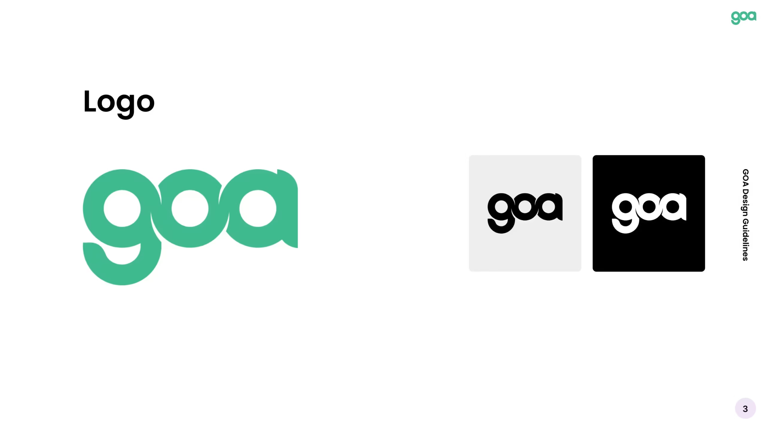
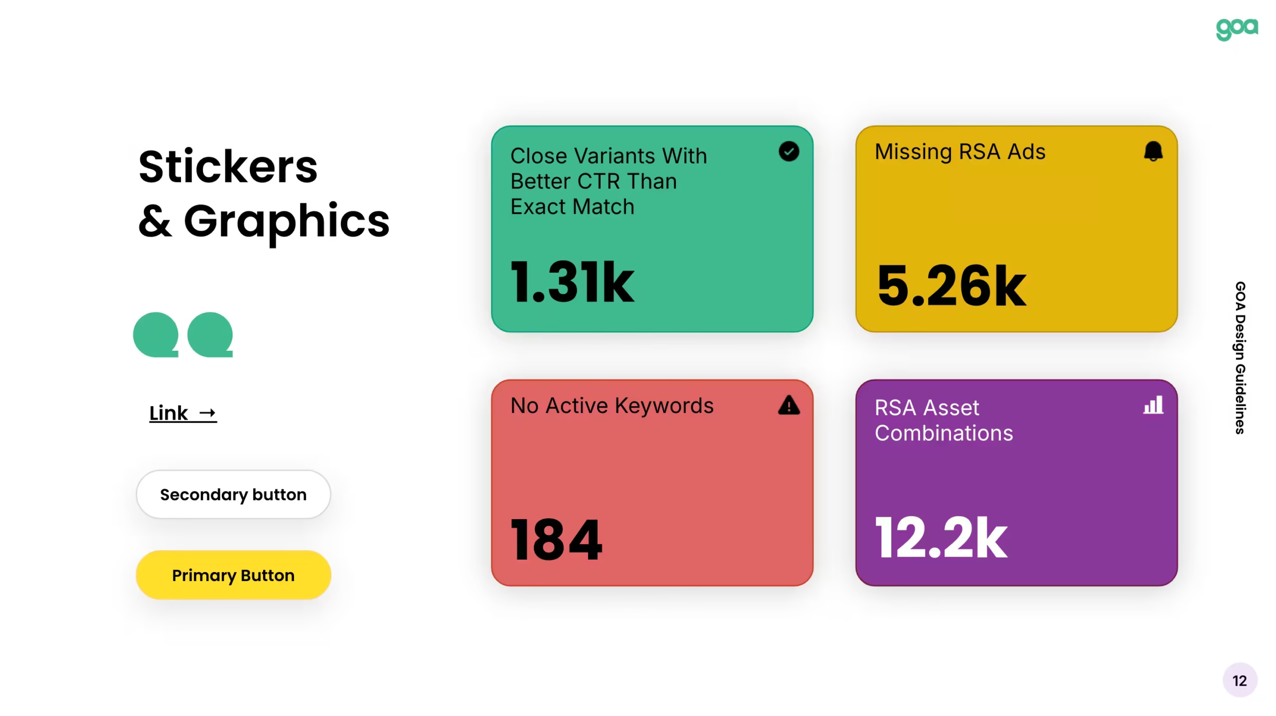
GOA Marketing needed a brand that communicated authority and expertise in the marketing field, without losing its approachable tone. We worked on refreshing their visual identity, aligning it with their reputation as leaders in marketing for large-scale businesses. From typography to colour schemes, every element was crafted to ensure consistency and clarity.
Brand Refresh
Subtle updates that modernised their identity while preserving their established visual language.
Positioning as Industry Leaders
A brand that communicates professionalism and expertise to high-end clients.
Unified Design Across Platforms
Ensured consistency in every touchpoint, from social media to email campaigns.
"Working with Eloise has been fantastic from start to - well it’s not finished yet, we keep finding new projects for her! From the get-go she’s understood the challenges we face as a small team and has been pivotal in shaping our brand vision. She really feels like an extended part of the team! Couldn’t recommend working with her enough!"
OLIVIA LAURISDEN - GOA MARKETING
LANDING PAGE DESIGN
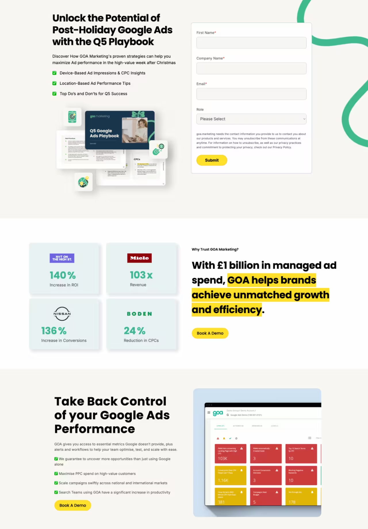
02. Optimising Landing Pages for High-Impact A/B Testing
To help GOA optimise their marketing efforts, we created landing pages designed to be tested and iterated on for maximum conversion. Each page was designed with a clear call-to-action (CTA), ensuring that the user journey was as frictionless as possible. By strategically A/B testing these pages, GOA was able to refine their messaging and better engage potential clients.
Conversion-Optimised Pages
A/B tested landing pages built with best practices for user experience and engagement.
Clear Calls-to-Action
Focused CTAs to drive users toward key goals and maximise conversion rates.
Data-Driven Design
Pages designed to gather insights and refine strategies based on user feedback.
MARKETING
03. Building Awareness and Engagement with a Downloadable Playbook
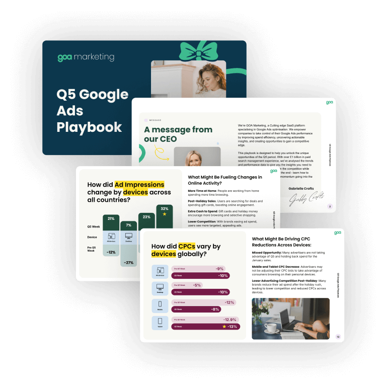
One of GOA’s key strategies for growth was to build their mailing list and position themselves as thought leaders in their industry. We created a downloadable playbook packed with valuable content, giving users actionable insights into marketing best practices for large-scale businesses. The playbook also served as a key tool for growing their mailing list and expanding their audience.
Lead Generation
Designed the playbook to be highly shareable and positioned as a valuable resource.
Content-Driven Awareness
Positioned GOA as an authority in the marketing space, offering practical insights to attract potential clients.
Expanded Mailing List
The playbook drove significant sign-ups and expanded GOA’s reach to key decision-makers.
Before we upgraded their designs
SOCIAL ASSET DESIGN
04. Social Media and Email Design for a Cohesive Brand Presence
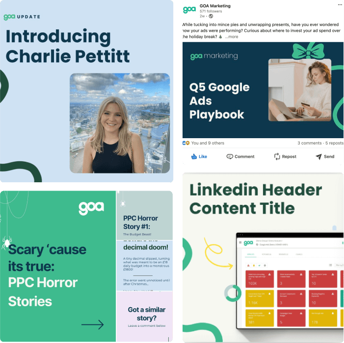
GOA’s social media assets and email campaigns were designed to be consistent with the refreshed brand identity. We created a range of social media graphics and email templates that helped solidify their presence across multiple channels. Using HubSpot, we ensured these assets were easily replicable and optimised for different platforms.
Social Media Assets
Visually compelling designs that kept GOA’s social presence cohesive and engaging.
Email Campaigns with HubSpot
Email designs that aligned with the brand identity and were optimised for conversions.
Cohesive Cross-Platform Branding
Ensured that GOA’s message was consistently presented across their social platforms and email campaigns.
6 WEEK DESIGN SPRINT
Want to achieve something similar?
Stop wasting time and money on design mistakes, let’s create user-centric solutions that build trust and let you concentrate on growing your business.a
Brand Audit
We’ll dive into your current design, spotlighting strengths and identifying gaps.
Design Sprint
Transformative, comprehensive, and efficient — a 6-week journey to a polished, high-converting user experience.
Tailored Solutions:
From design systems to engaging interfaces, every detail is crafted to suit your brand.
Get started with this sprint and enjoy the confidence of a fully aligned, user-ready brand identity or service.
