A Modern Brand Refresh for an Audio and Automotive Tech Organisation
01.
Overview
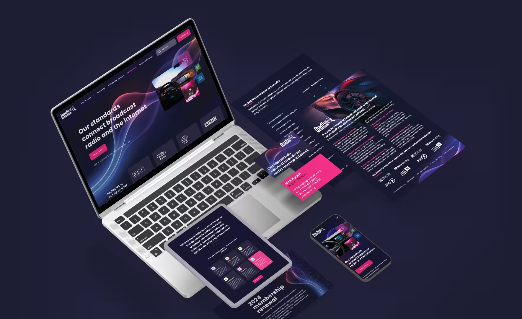
A brand and UX refresh that helped a global tech team communicate their value faster and guide users with confidence.
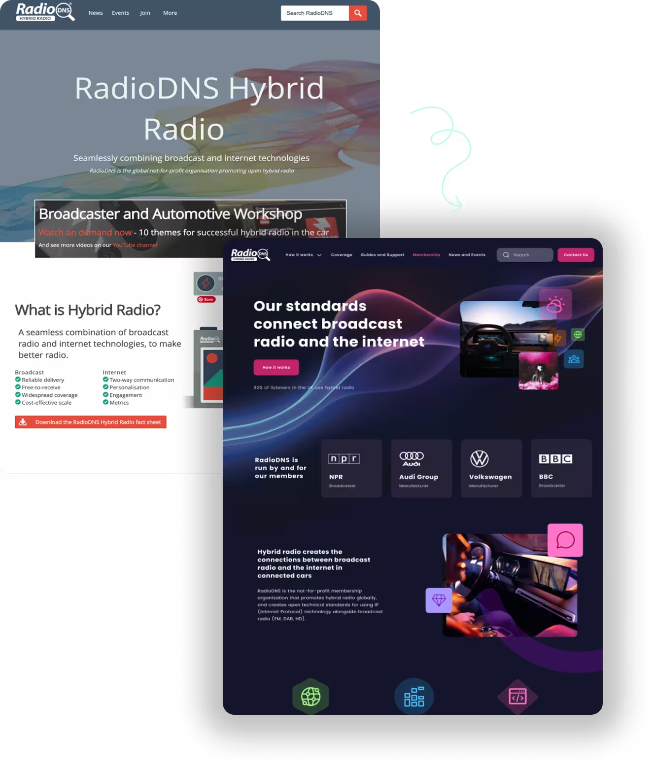
Before and After of the Homepage for RadioDNS
02.
The Challenges
RadioDNS didn’t need a full reinvention.
They had the expertise and the reputation but the visuals and UX weren’t keeping up. For a team leading the future of hybrid radio and automotive tech, the brand needed to look as modern and trusted as the work behind it.
✤ Visual identity starting to undermine credibility
✤ Navigation that made core information hard to find
✤ No dark mode for users working in low-light environments
✤ Typography that didn’t meet accessibility standards
✤ No scalable design system to grow their guidelines confidently
They asked a key question many teams ask:
“How do we modernise our brand while keeping the trust and clarity that technical users rely on?”
03.
Brand Refresh
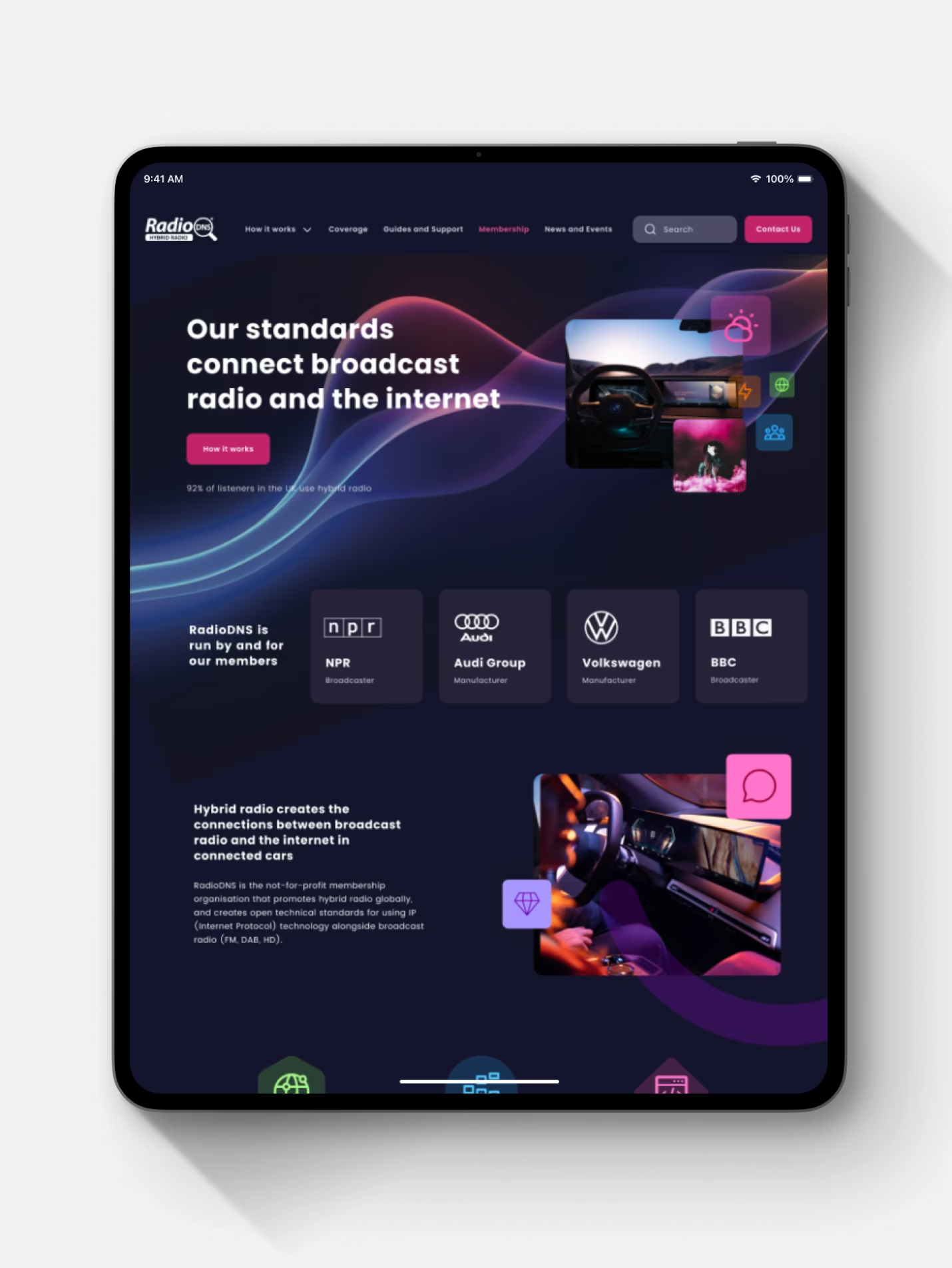
A dark mode design system loved by the technical audience
I introduced a dark interface that works naturally for engineers and technical users in low light. The updated colour system and cleaner typography instantly lifted the whole experience. I created a new icon library and refreshed all key brand materials so everything finally felt like one connected system.
✤ New dark mode built for low-light technical environments.
✤ More legible typography and a sharper, modern colour system.
✤ Custom icon set and extended visuals across all brand touchpoints.

04.
User Experience
Stronger usability and clearer content pathways
I rebuilt the navigation so users could find what they needed without stopping to think. Search and sign-in were added for instant access and global wayfinding was tightened up so every page felt more grounded and predictable.
✤ Clearer navigation that makes key information easier to find.
✤ Faster access with new search and sign-in pathways.
✤ Stronger wayfinding through improved footer and page structure.
05.
Design System
A scalable system ready for future guideline expansion
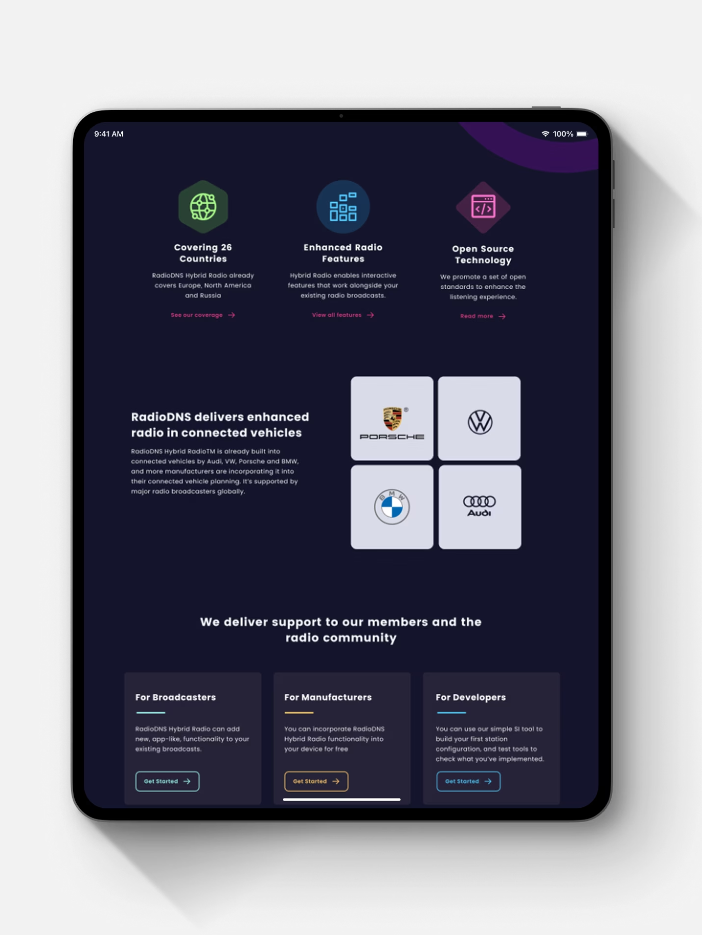
I set up a flexible set of components that will grow with the organisation. The structure works consistently across web, documentation and printed material so the team can keep expanding their guidelines without creating chaos.
✤ Created scalable interface patterns that support future guideline pages
✤ Ensured all components work across print, web, documentation and digital tools
"The engagement with our thinking, exploration of the visual elements, and creating the manifestations of our new brand - physical and online was beyond expectations."
Nick Piggott • RadioDNS

06.
The Results
The RadioDNS platform is now clear, modern and genuinely easy to use.
The entire experience feels more confident and more aligned with the organisation’s expertise and the team can build and grow their guidelines without fighting the design. It finally looks and functions like the trusted, technically brilliant organisation it already was.


Key Takeaways
✤ Modern tech audiences expect clarity first
Clean structure and improved navigation instantly lifted usability for developers, broadcasters and partners.
✤ Dark mode isn’t aesthetic, it’s functional
The darker theme supports real-world working environments and improved accessibility.
✤ A system that scales saves time later
Icons, typography, components and page patterns now work cohesively across ongoing guideline development.
✤ Stronger identity = stronger trust
The refreshed look and improved UX signalled confidence and technical leadership to their global audience.
✤ Brand, website, and customer experience
Design I can help you with
Stop wasting time and money on design mistakes, let’s create user-centric solutions that build trust and let you concentrate on growing your business.
Brand clarity and identity design
Untangle what you’ve got and give you a look and feel that’s unmistakably yours.
Website design and refresh
User-friendly, mobile-ready, and built to convert.
Customer experience design (CX & UX)
Smoother journeys that build trust and loyalty.
Product and platform design
From apps to dashboards, interfaces that just make sense.