Rock FM
Creating a modern rock radio identity that avoids nostalgia traps
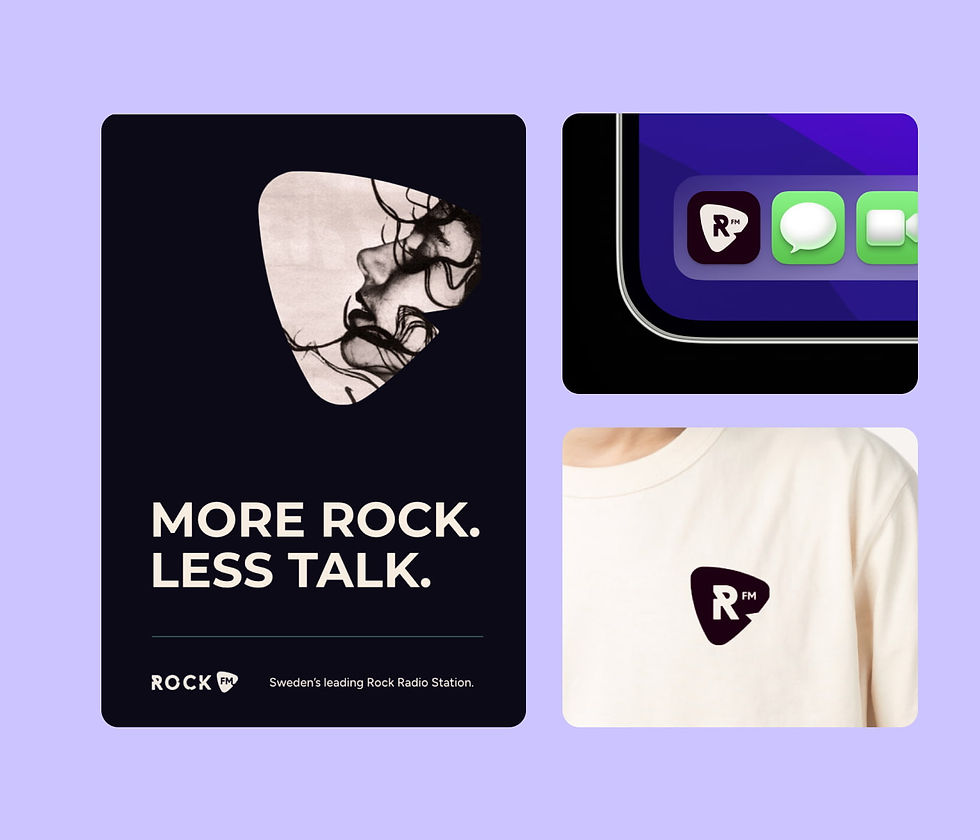
Rock FM is a Swedish radio station aimed at adults who care about music, craft, and authenticity. The challenge was to reference rock culture without defaulting to distressed type, guitars, or retro pastiche. I was brought in to explore identity concepts that felt premium, modern, and grounded in Scandinavian design.
Brand identity, logo design, colour system, visual direction
A confident, recognisable identity that reflects rock culture without leaning on tired visuals
.jpg)

These were the things getting in the way
Rock FM needed a strong identity, but one that didn’t feel dated or overly aggressive.
The brand needed more clarity and confidence.
Visuals weren’t working consistently across platforms.
There was no clear structure to build on.
The tone needed tightening without losing edge.
Nostalgia works better when it’s handled with restraint.
What happened when we untangled those issues?
By sharpening the system and visual language, the brand became bolder and more controlled.
A clearer, more deliberate visual identity.
Improved consistency across digital and broadcast.
A system that holds the brand together.
A look that feels confident without shouting.