Web | Branding
Write Cornwall
Brand Refresh and Website Redesign: Write Cornwall
Fifteen years of expertise, one very dense website. We sorted that.


Freya Thomas is the founder of Write Cornwall, a bid and grant writing consultancy supporting organisations across the South West. With deep specialist expertise and years of experience helping clients navigate complex, high-stakes funding landscapes, Freya offers calm, expert support in a field that can feel overwhelming even to people who've been in it for years.
What the website was hiding
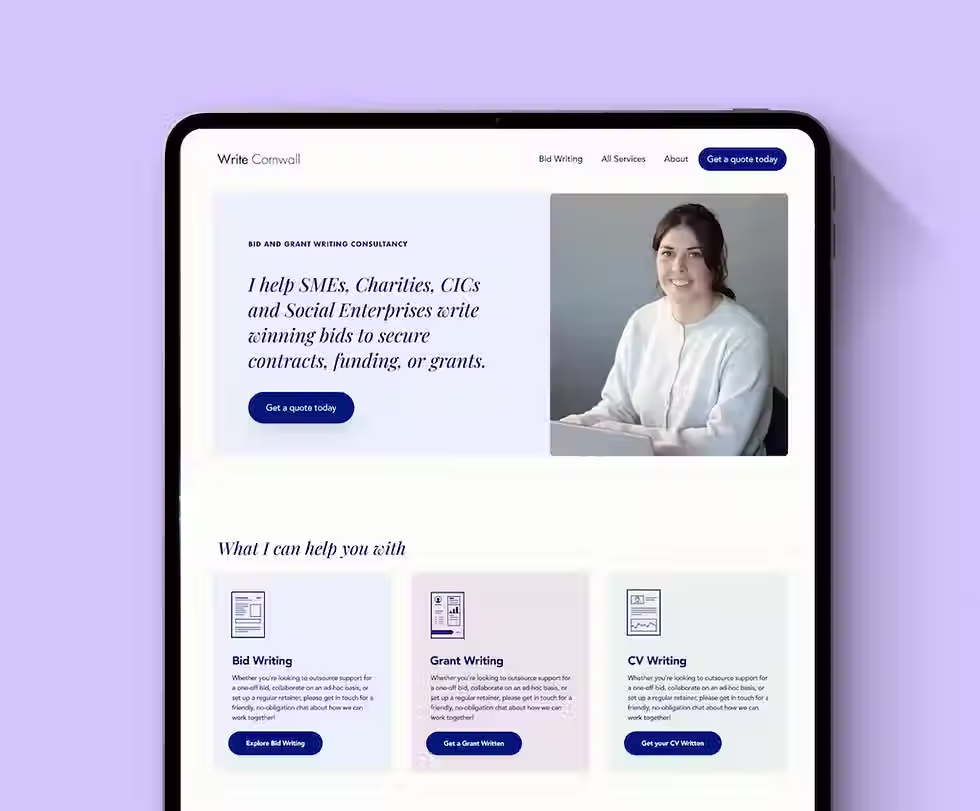
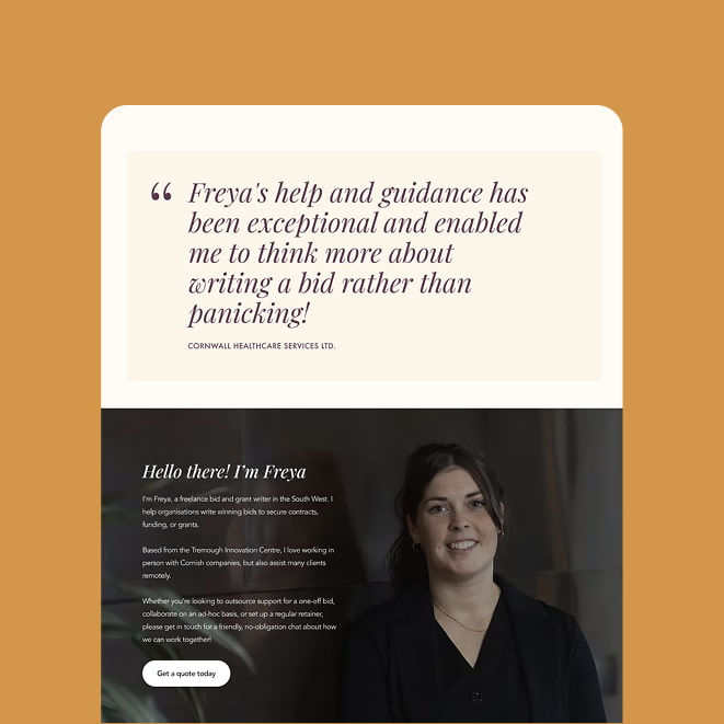
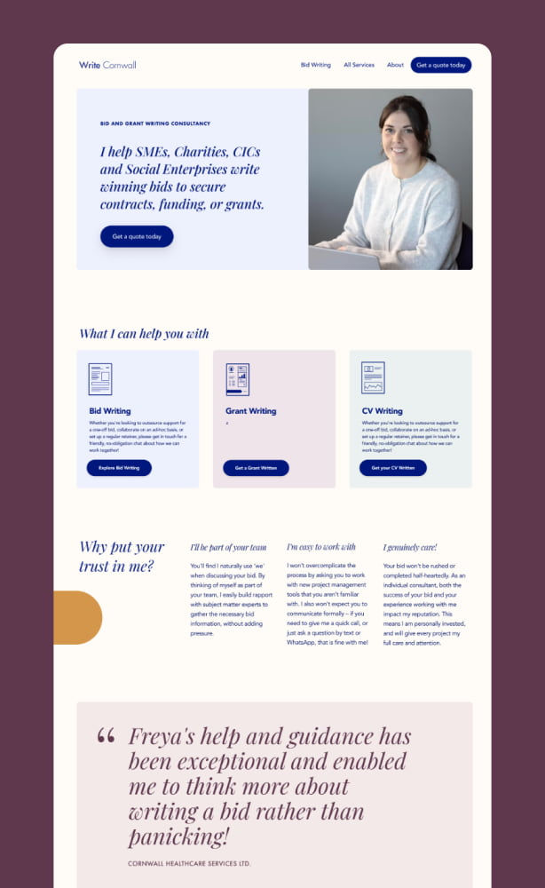
The foundations were genuinely solid. The deep blue palette communicated trust and professionalism, the coastal photography grounded the brand clearly in Cornwall, and Freya's track record spoke for itself. But the website was making visitors work too hard to see any of that. The body copy font was difficult to read. Content was packed together with very little breathing room, creating real fatigue for anyone trying to get through a page. Testimonials, which should have been the most convincing thing on the site, blended into the background rather than standing out. The header used valuable space without telling a first-time visitor what Write Cornwall actually does. And the contact form didn't give potential clients a way to share the detail Freya needed to properly assess whether a project was the right fit.
The brand also needed to better reflect how Freya works: expert and credible, but personal and approachable, with a clear sense that this is a one-person consultancy and not a faceless corporate agency.

What we worked on together
The brand audit identified what was working and what needed attention, then work began on a refreshed colour palette built around the deep brand blue, with accessible supporting colours for buttons, links, and text backgrounds, all checked against contrast guidelines. Space Grotesque was introduced as the header font, with a cleaner, more legible body copy font to replace the existing one.
A Wix mock-up was built to show how imagery, key benefits, and a tighter layout could immediately communicate Freya's value to someone landing on the site for the first time. Navigation was reviewed for clarity, and the contact form was redesigned to walk potential clients through the right questions from the start, so enquiries arrive with the information Freya actually needs.


The expertise was there from day one. The website just wasn't showing it.

A brand and website that earn the trust Freya already deserves
A refreshed colour palette that meets accessibility contrast guidelines and works with the existing brand blue
A new font system with a legible body copy font that actually helps people read
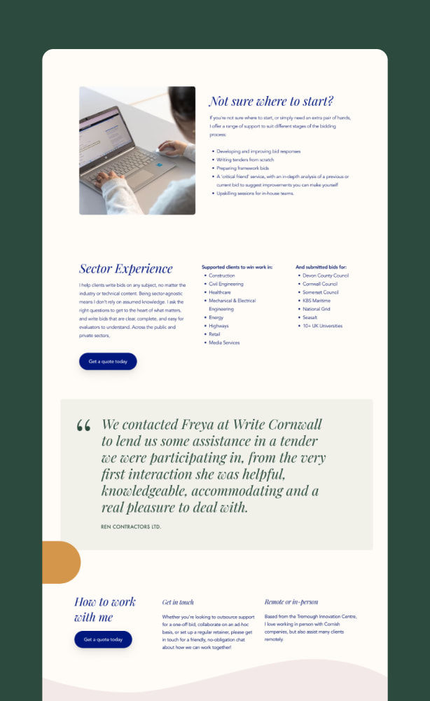
Restructured page layouts that guide visitors towards getting in touch
Testimonials surfaced and repositioned to do the trust-building work they're meant to do
A redesigned contact form that qualifies enquiries before the first call
